
 Feed
Feed Follow
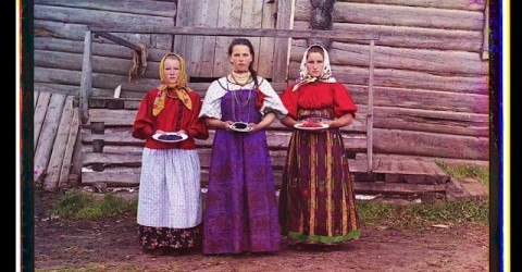
As I fall into a swirl of sensory stimulation, I give more thanks to the Library of Congress for providing me imagination fuel.
 There is an inherent distance in early photography. Not to downplay the crisp chemical beauty of a tintype or ambrotype, but I think the lack of color serves as a physical boundary between then and now, relegating the image to the distant past and, to an extent reducing the reality (so to speak) of the subject. Yes there are exceptions. Robert Cornelius’ self-portrait (left), one of, if not THE, first photograph of a human ever, is so romantically perfect that it is haunting; I even think he is pretty hot. However, for the most part, I don’t think that I fully appreciate the former tangibility of the people in non-color photographs. Every time extremely early color photographs are put on display, I am shocked.
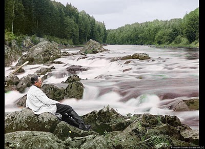
I have been thinking about “color shock” for a while and, if you will excuse the pun, these photographs from the Library of Congress* bring this phenomenon into sharp focus. Taken in Russia between 1909 and 1915, these color people are much closer to me in felt time than they would have been in black and white. I always had the feeling that somehow people LOOKED fundamentally different in the past, but I think that is entirely to do with the medium of black and white. That difference is eliminated with the addition of color. These were people. They look totally normal.
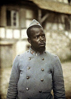
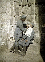
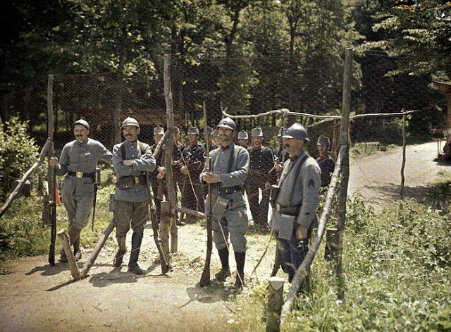
A had the same experience when a series of French color photographs from World War I were released five or six years ago. My first and, frankly, my continued reaction is that they feel less old than other photos from the same time period. I can mentally animate the figures and experience them as humans. I have an incredibly difficult time placing them as far back in the past as I need to. Despite the clothing, I can’t put them back farther than my mother’s childhood in the 1950s. Yet, this is my great-grandfather’s youth, but I have never seen him in color.
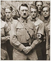
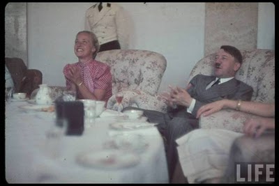
Then again, perhaps we enjoy this color boundary in some cases. I remember when color photographs of Adolph Hitler were released I felt very disturbed by them. I live in a world where Hitler has come to symbolize a sort of inhuman pure evil. This darkness was cleanly maintained by the starkness of every one of the thousands of black and white photos and films of him that I have seen. When Life shared color photos of him, my neat and tidy, black and white, good and evil world was rocked. Hitler the inhuman became Hitler the tired looking dude with an uneven hair cut at a car show in 1939 or Hitler that guy in the sharp suit having a chuckle with a pretty lady. He is just some boring guy. How can evil be so bland? Compare color Hitler to black and white Hitler…different emotions?
 Perhaps this is obvious and surely this in natural: we humans react to other humans and color humans are more human than black and white ones. Knowing this doesn’t change how I experience these Russian photographs. I wouldn’t look twice (if I even looked once) at black and white photos from that period, however I find myself sitting here clicking through these over and over again. I have plowed through midnight and 1am and I am still looking.
Why am I always surprised that the past was reality?


